Etherio
Branding / Packaging / Digital
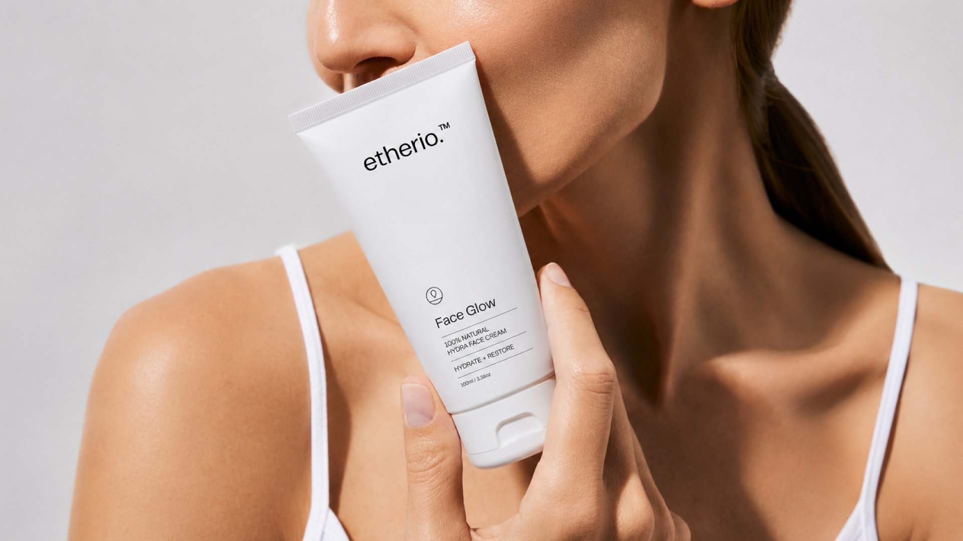
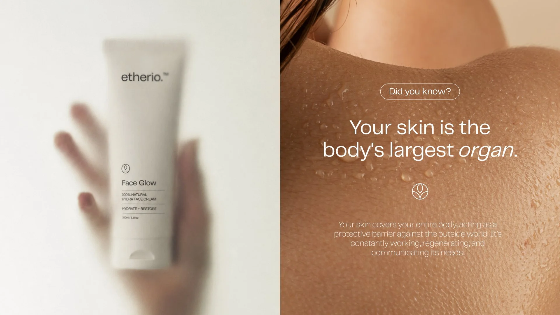
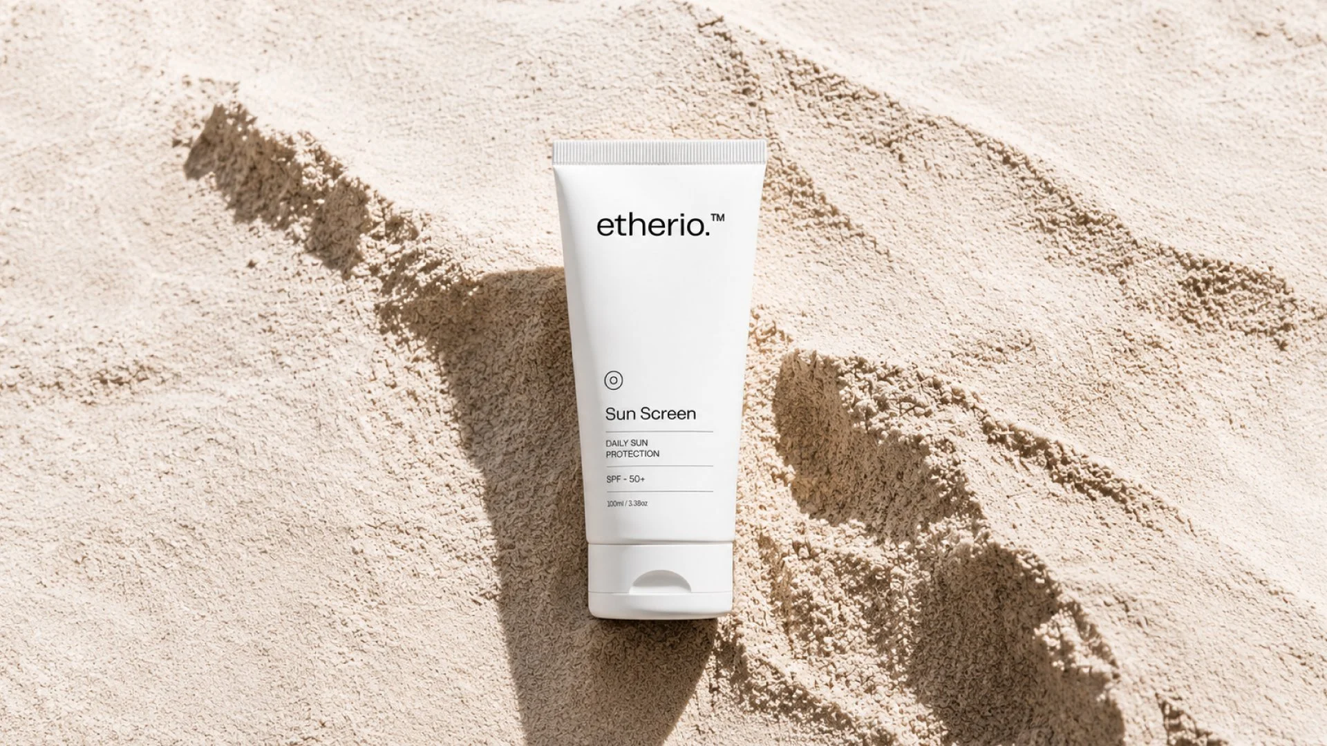
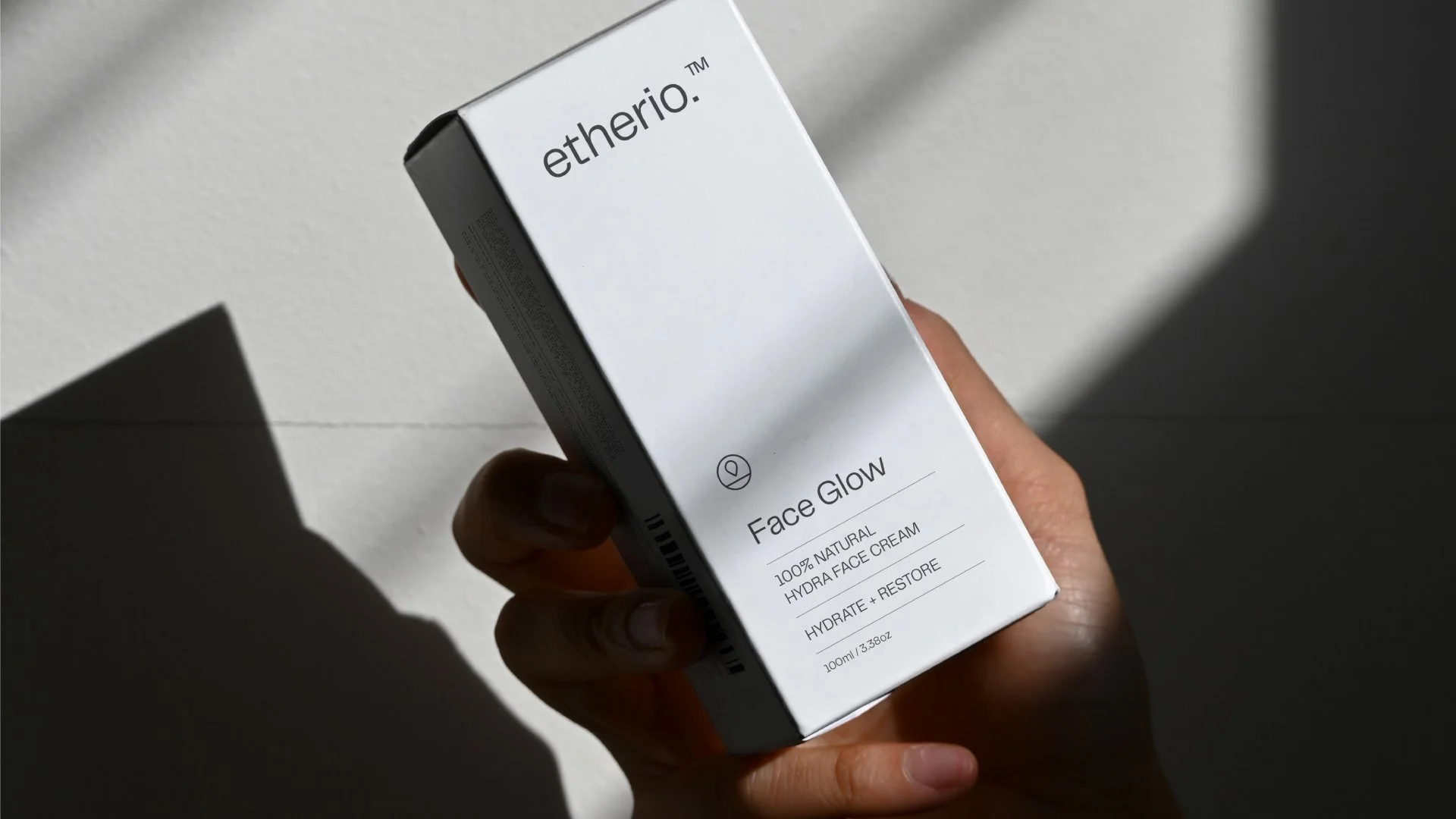
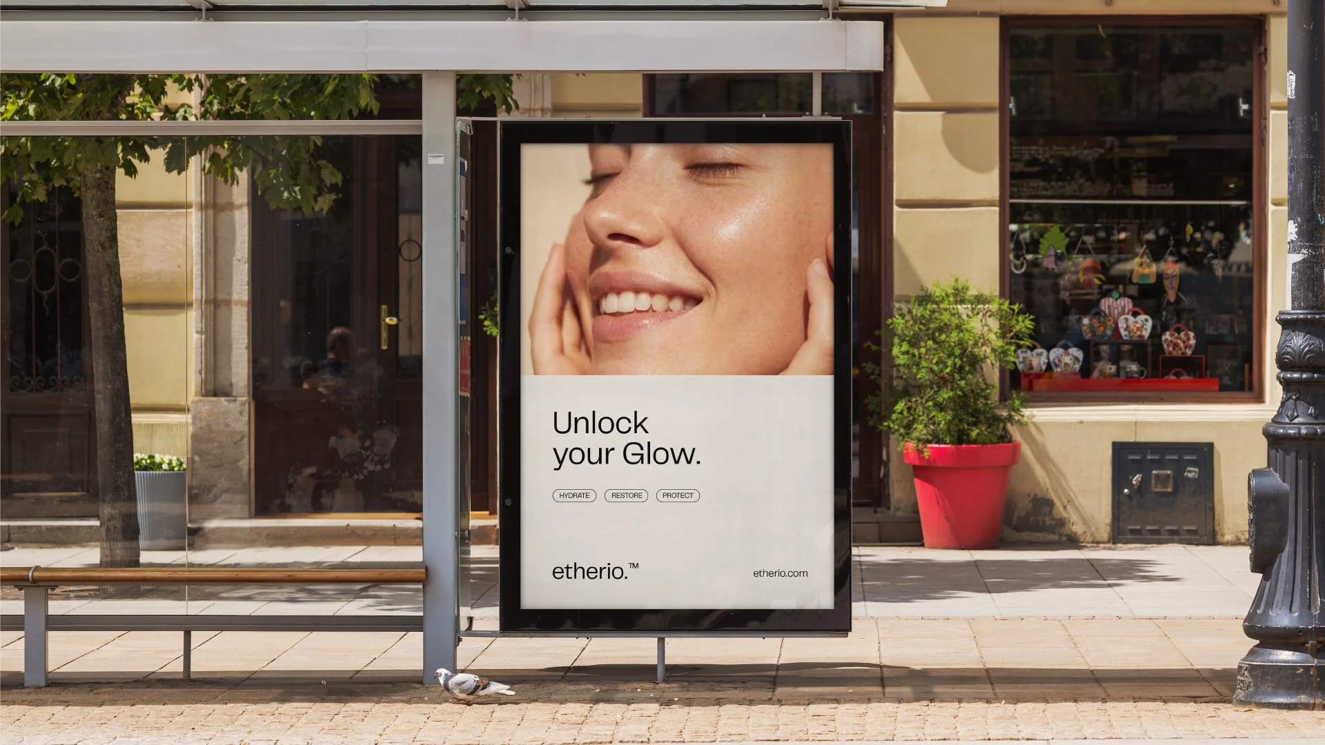
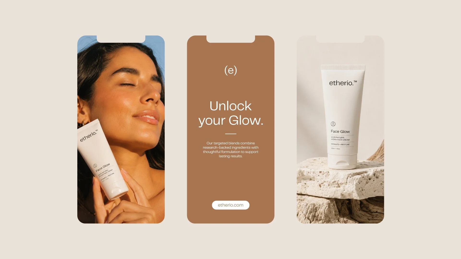
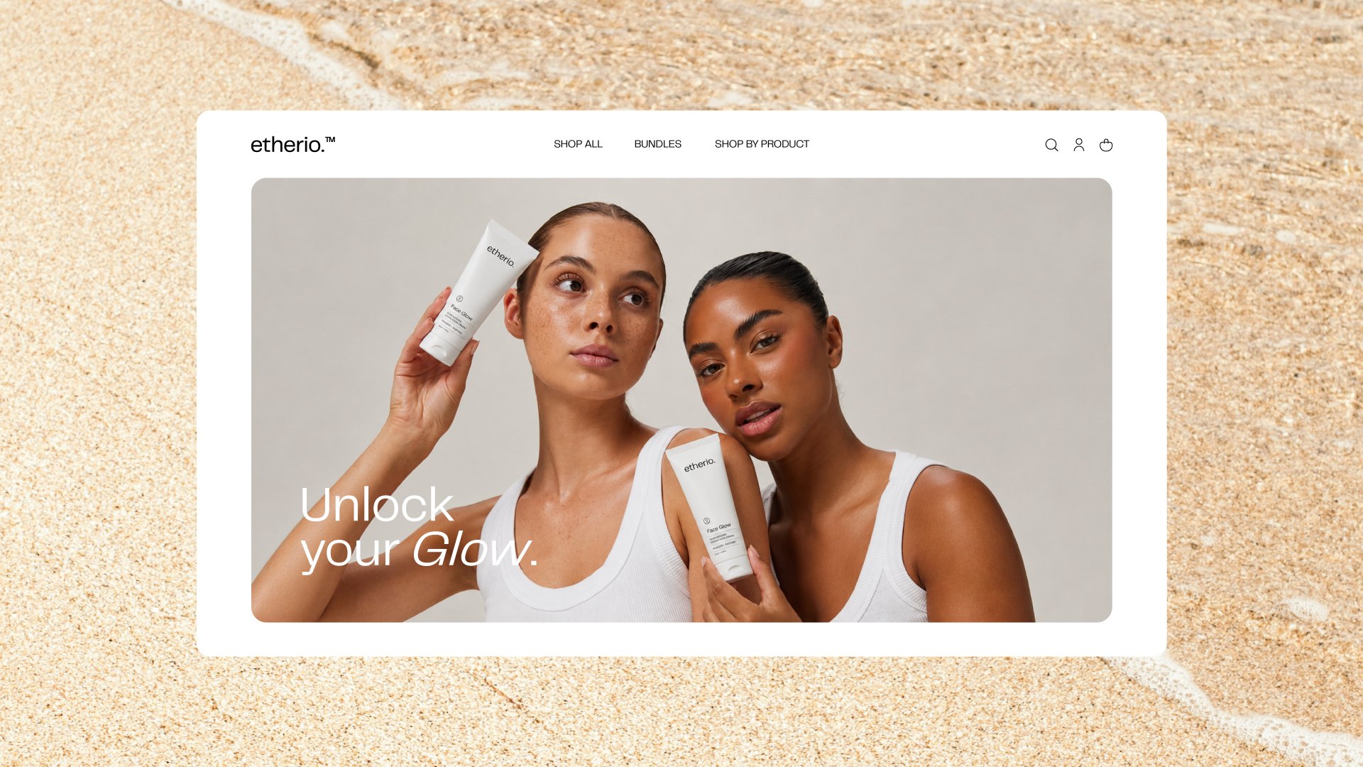
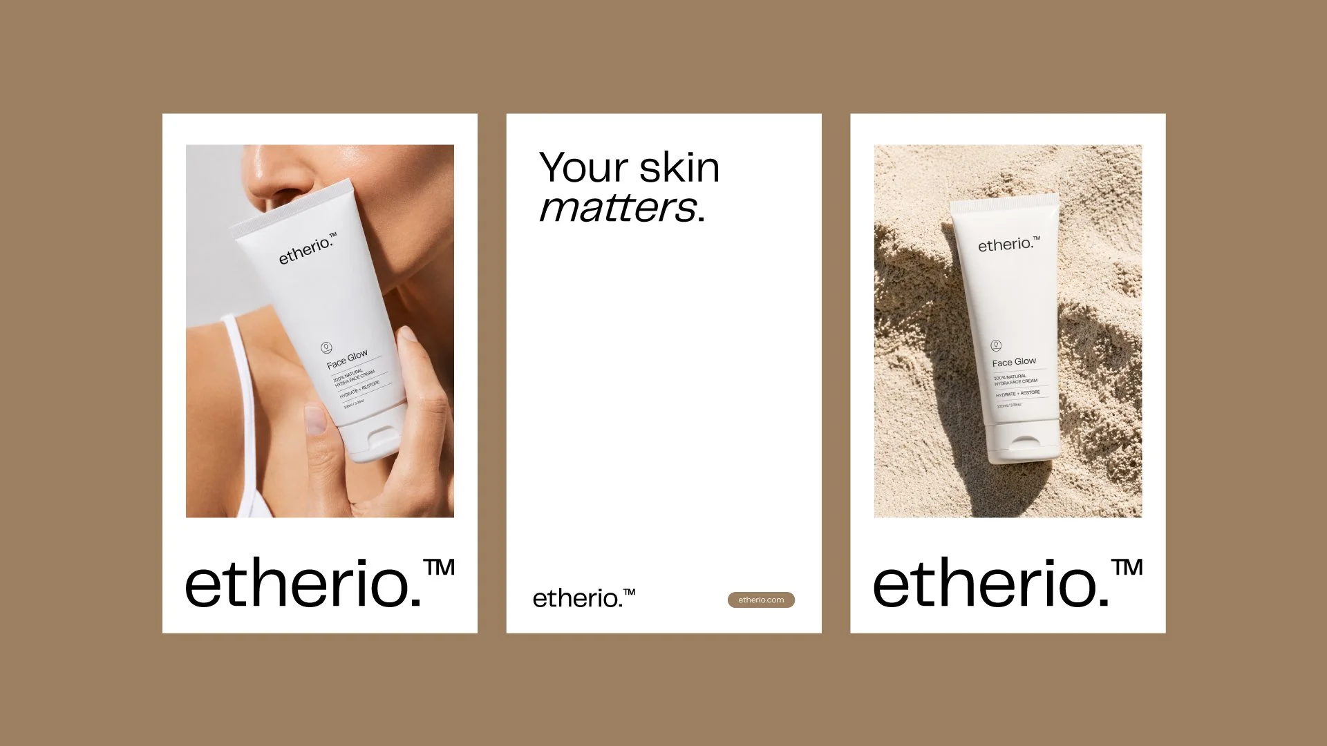
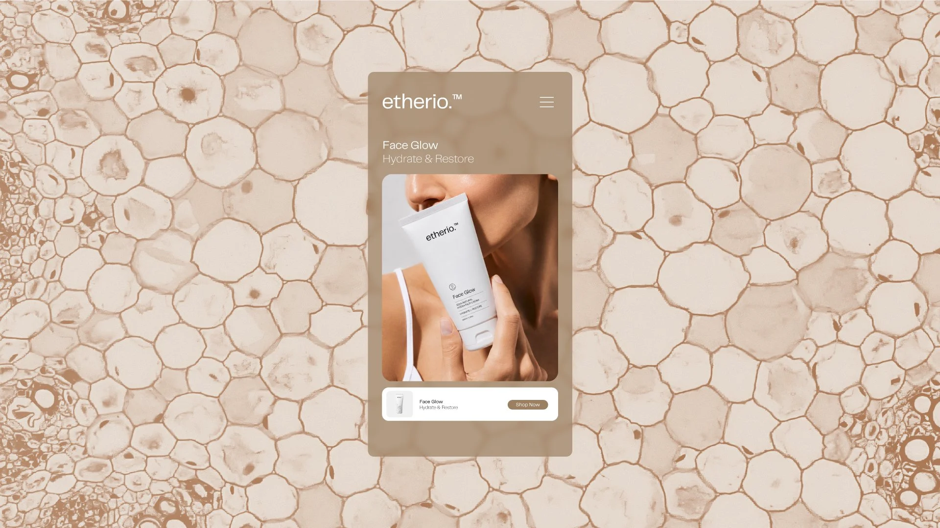
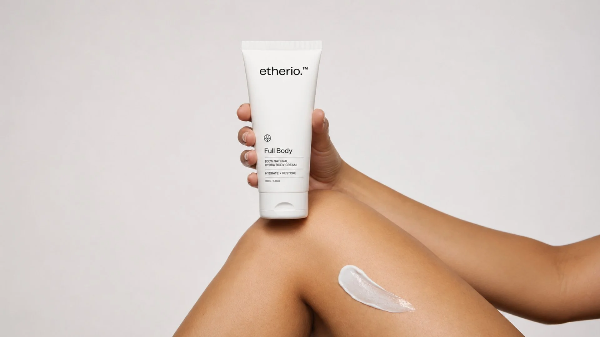
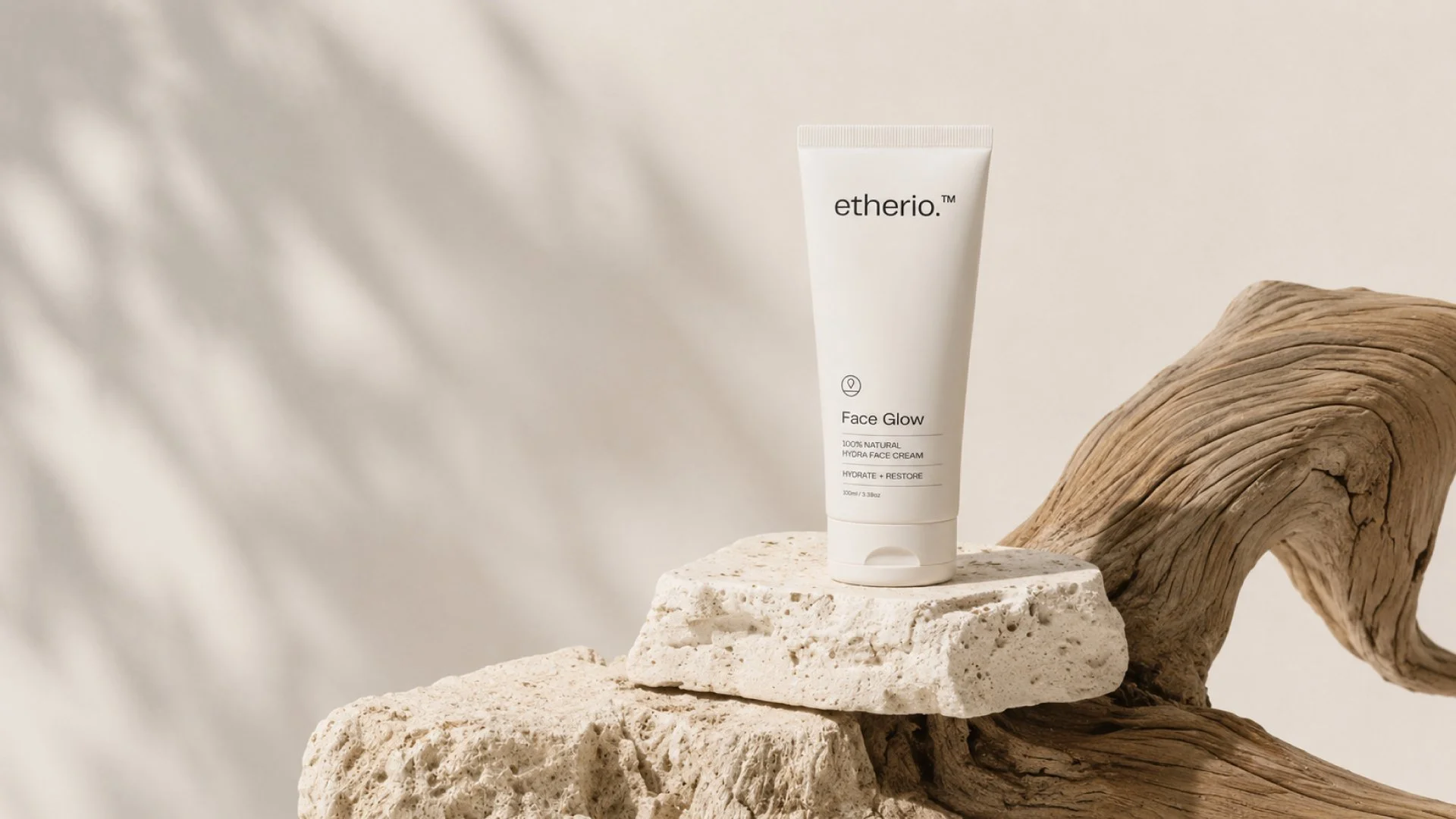
Etherio was designed around the idea that skincare should feel calm, intentional, and effortless. The visual identity embraces minimalism through clean typography, generous white space, and nature-inspired color palette tones that evoke warmth, balance, and a natural sense of well-being. Every element was chosen to create a quiet, refined aesthetic that reflects the simplicity of a daily skincare routine.
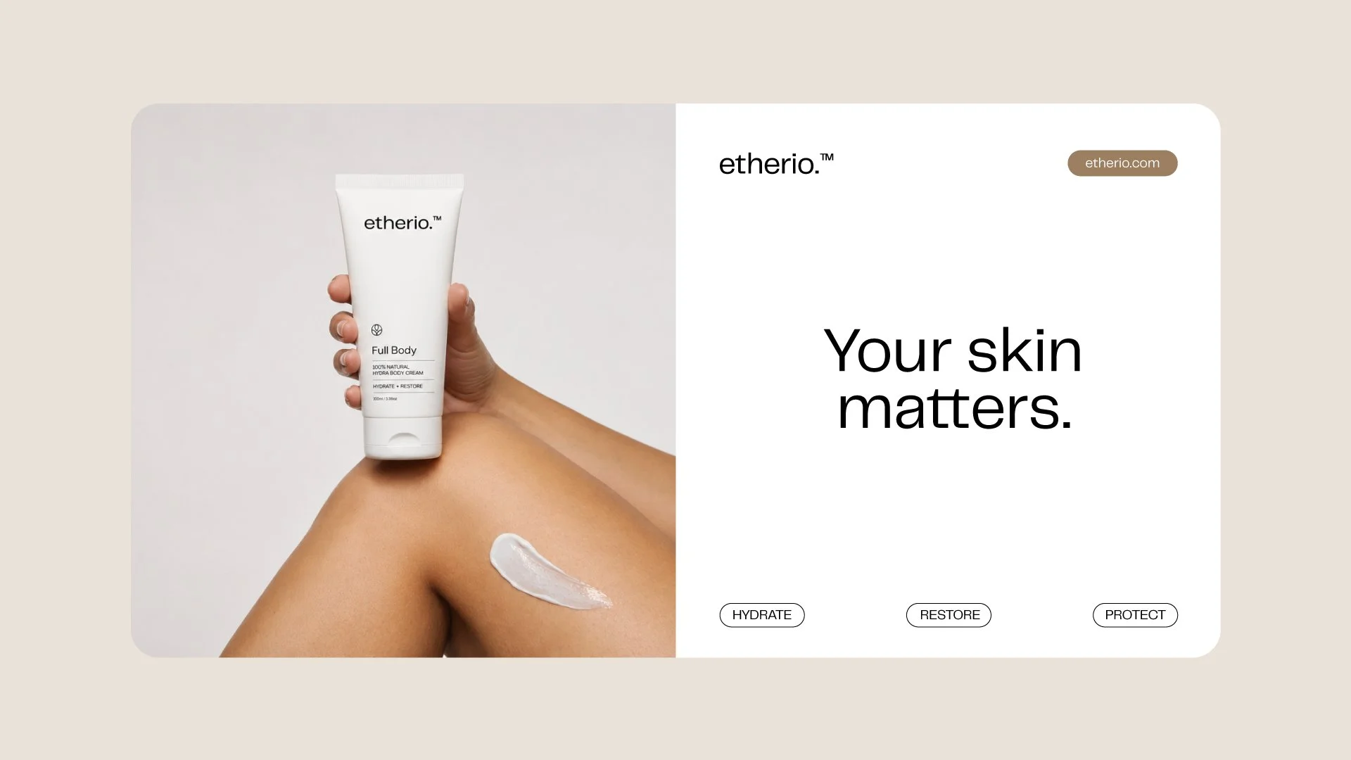
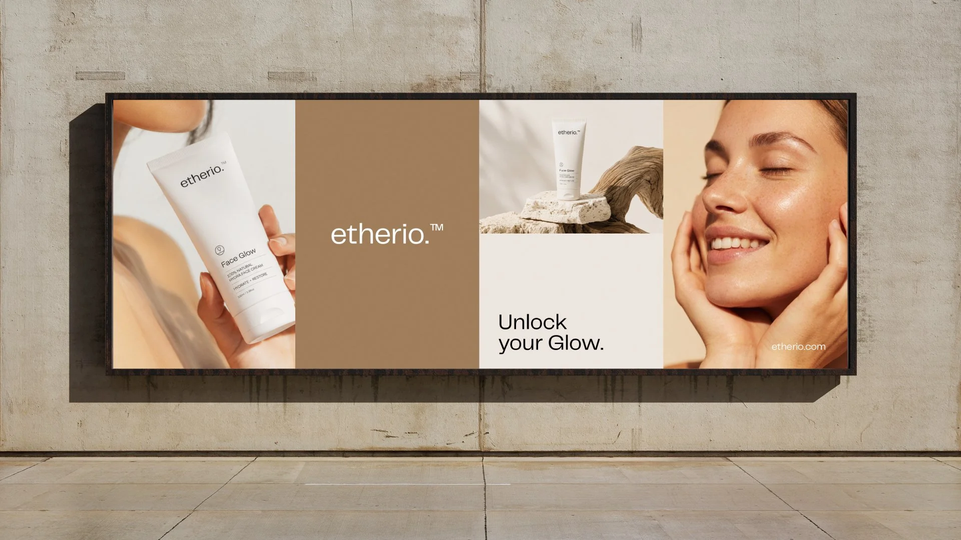
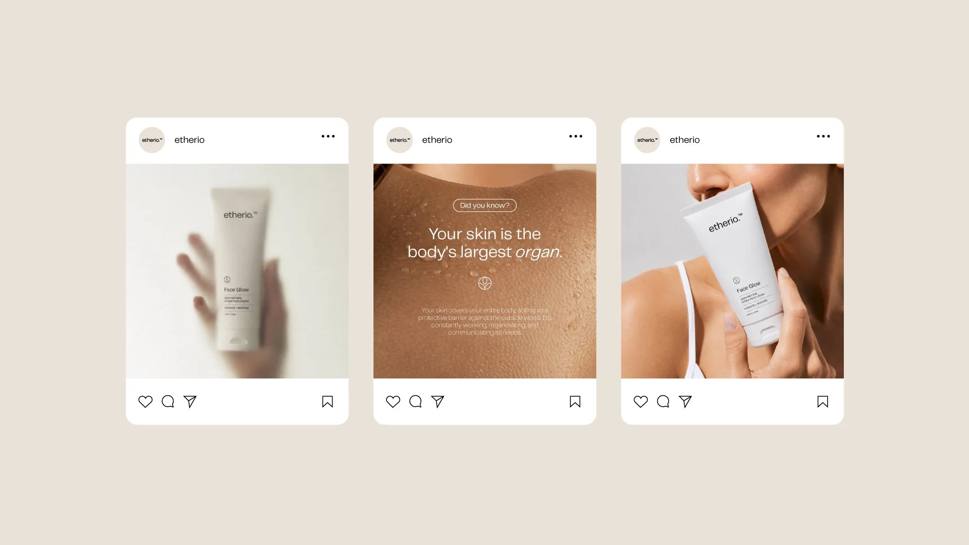
The branding extends across packaging and digital touchpoints with a consistent focus on clarity and balance. Each application of the identity prioritizes harmony and ease, ensuring that nothing feels excessive or distracting. The result is a cohesive system that supports a gentle, considered experience across every interaction with the brand.